Another roll of Rollei. Now up at ISO 400, but rather than RPX 400 (featured previously), this is Retro 400S. The difference? A slightly different base (PET vs Triazetate), although that has little to no effect on the final photographs. Retro 400S also has slight infrared sensitivity (down to 730nm compared to RPX400 at 660nm). This means given an infrared filter it should be possible to shoot infrared shots on 400S. I didn’t do this, either, though, so the point is moot. Apparently RPX 400 might push and pull a little better, but I didn’t test this either. So in reality… minimal difference!
I was pretty impressed with the results. Unlike the first Rollei roll, which had some serious lightleaks in the can, this roll seems to have come out pretty much perfectly. Further, the felt used to “fix” the small lightleak in the camera body is holding up, with no signs of fogging at the bottom of the frames. Finally, the grain here was pretty fine, effectively comparable to Ilford HP5+. Big thumbs up, to my eye!
Camera: Ricoh KR-10 Super
Lens:
Film: Rollei Retro 400S
Post Processing: GIMP
Macro Showcase

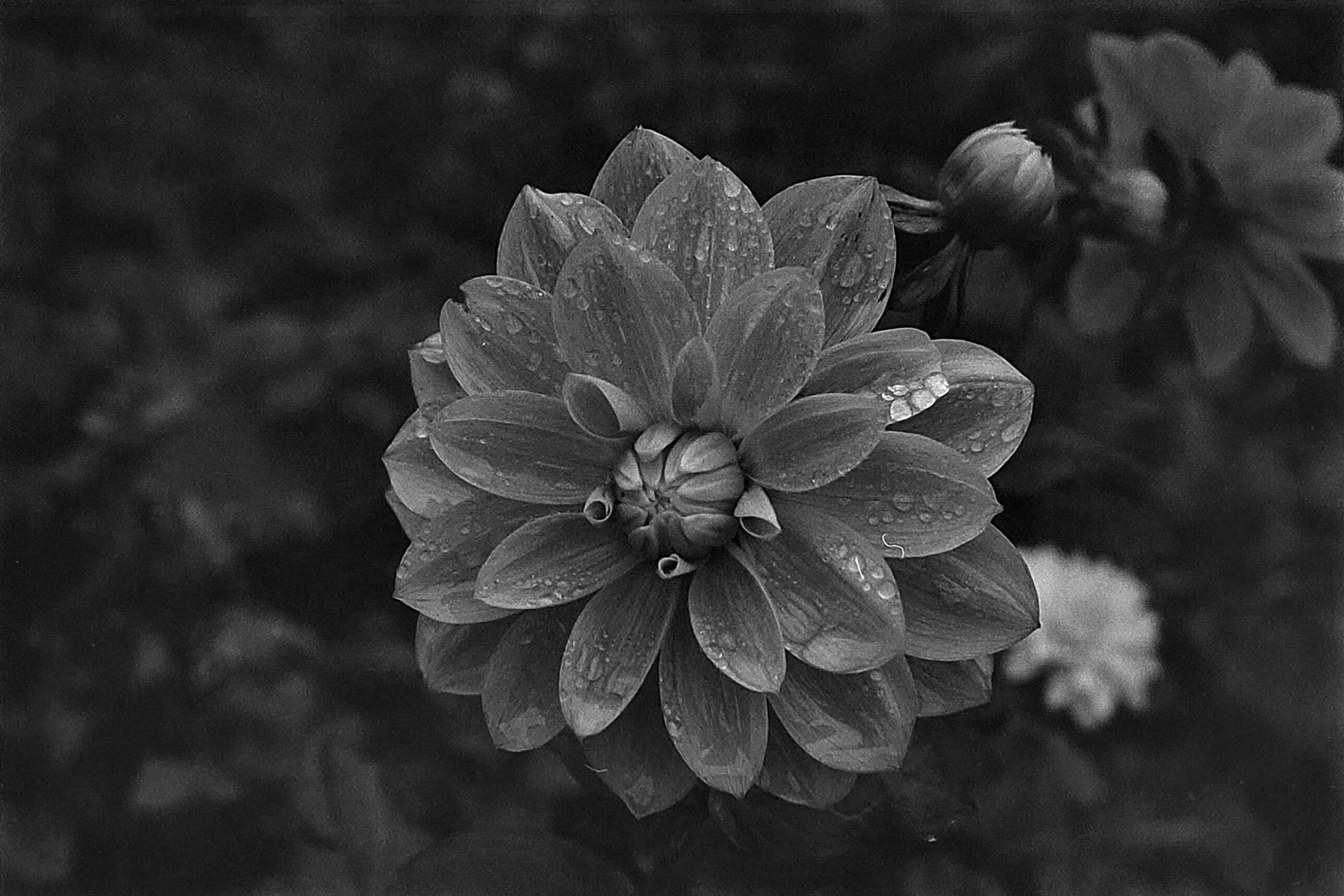
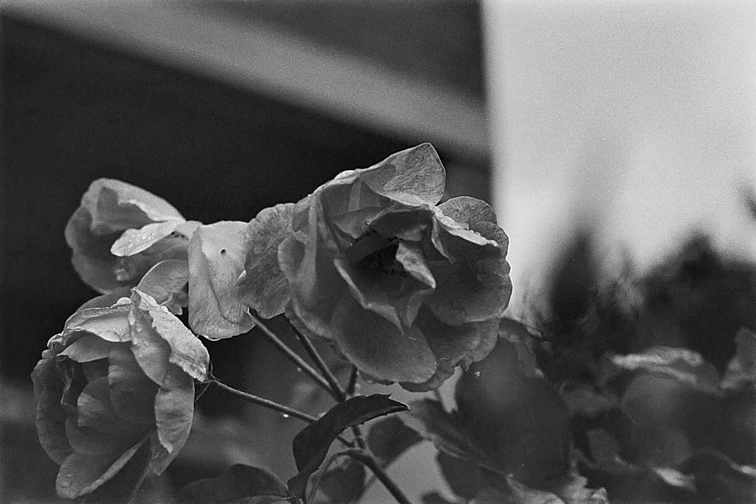
The flowers in this roll came out spectacularly. Very happy with the results.
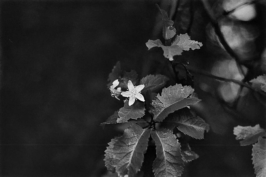
A nice macro flower shot, with the bonus of getting the foliage in focus, too. 
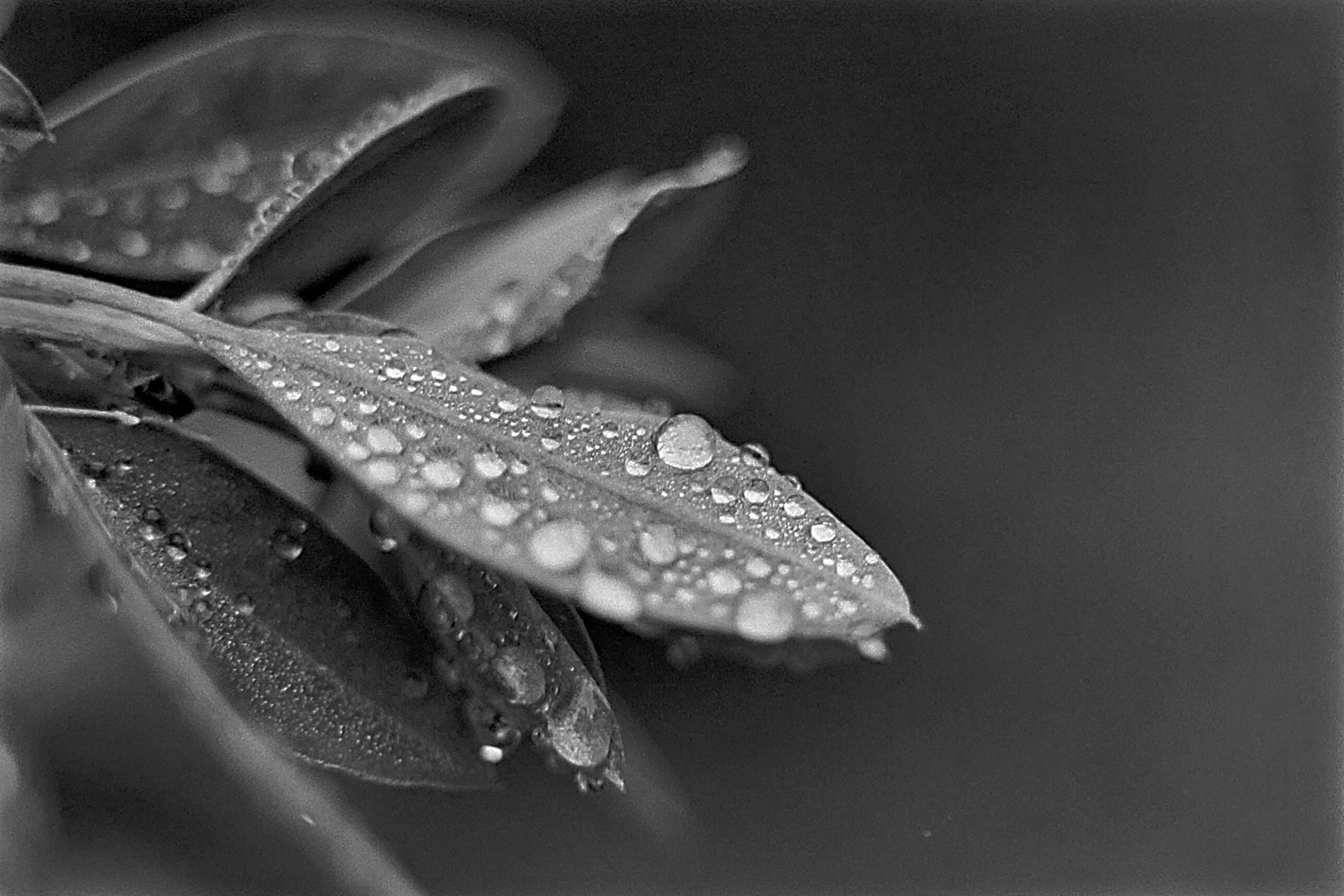
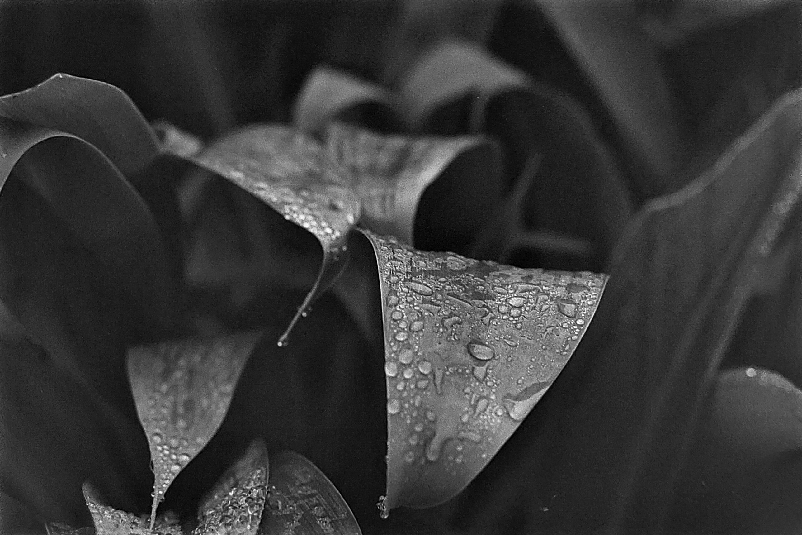
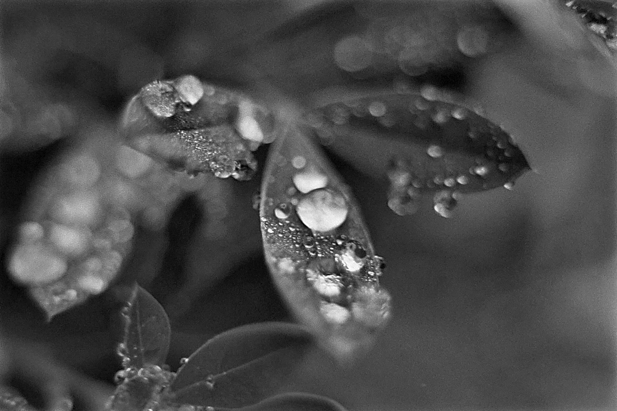
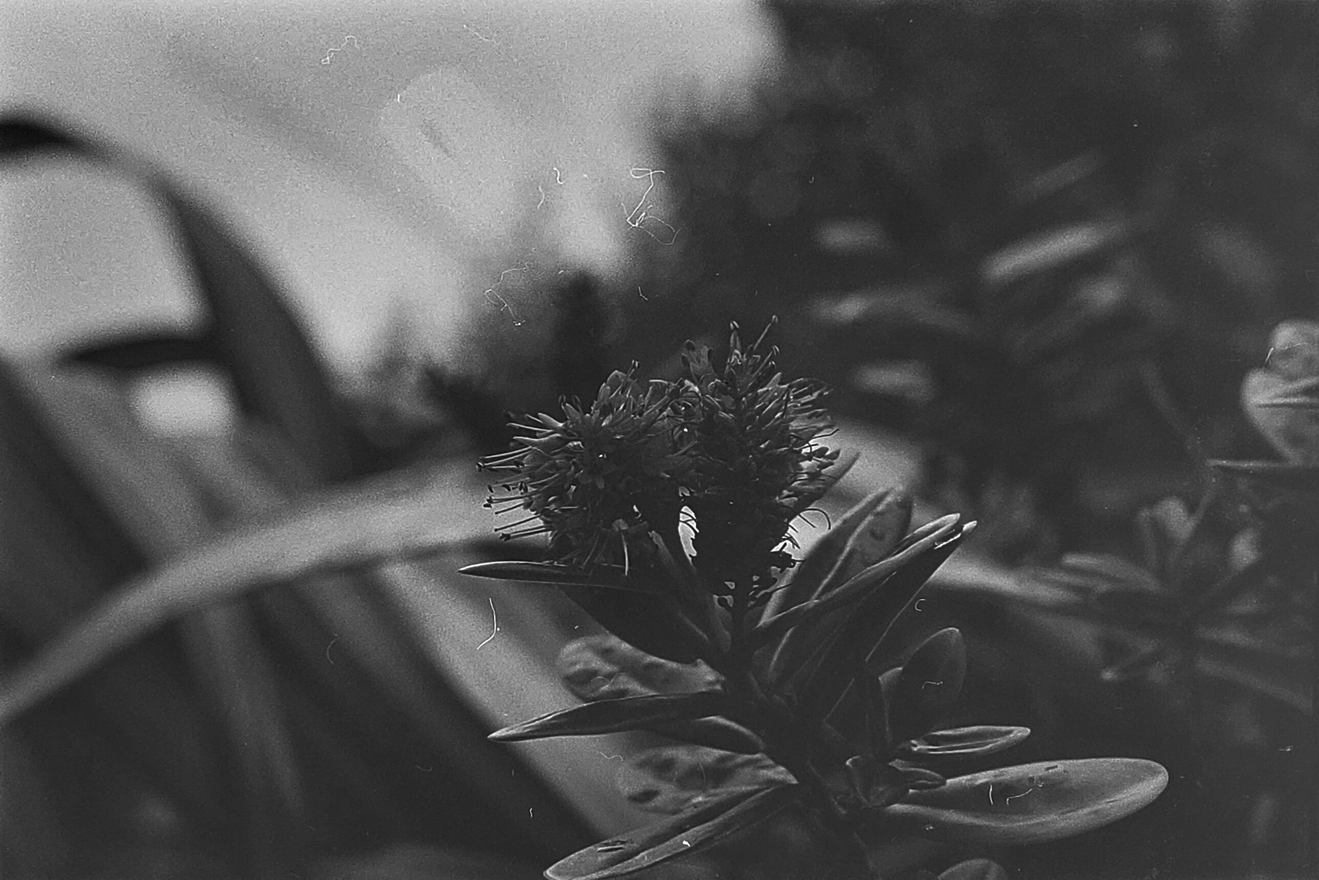
Using some macro extension tubes to get an extreme close up of dew on an individual leaf. Very happy with how this came out (and the related frames below). I think this kind of photograph works extremely well on black and white film! 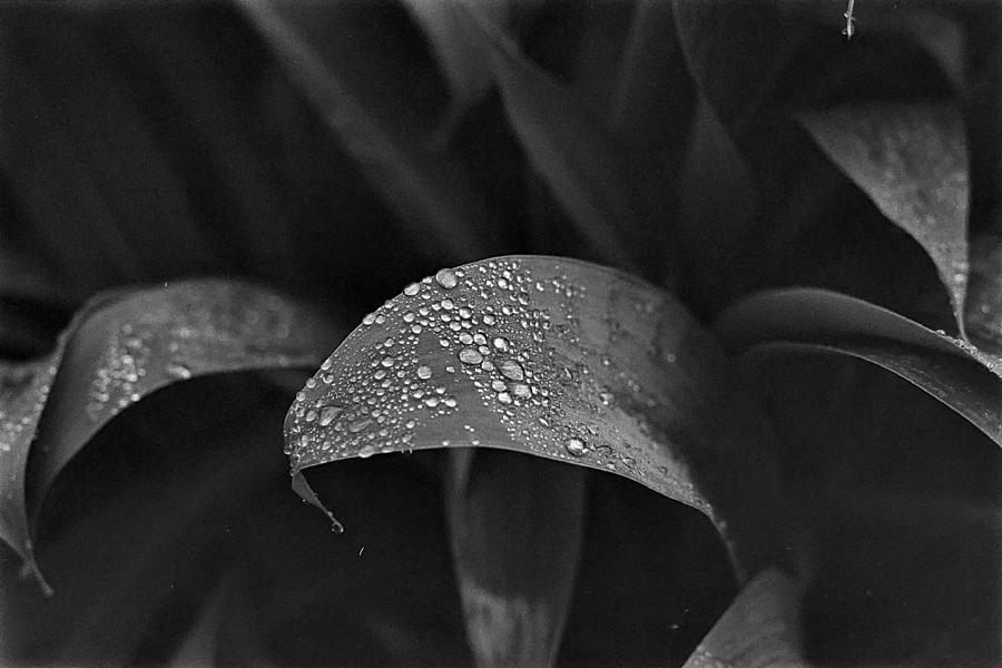
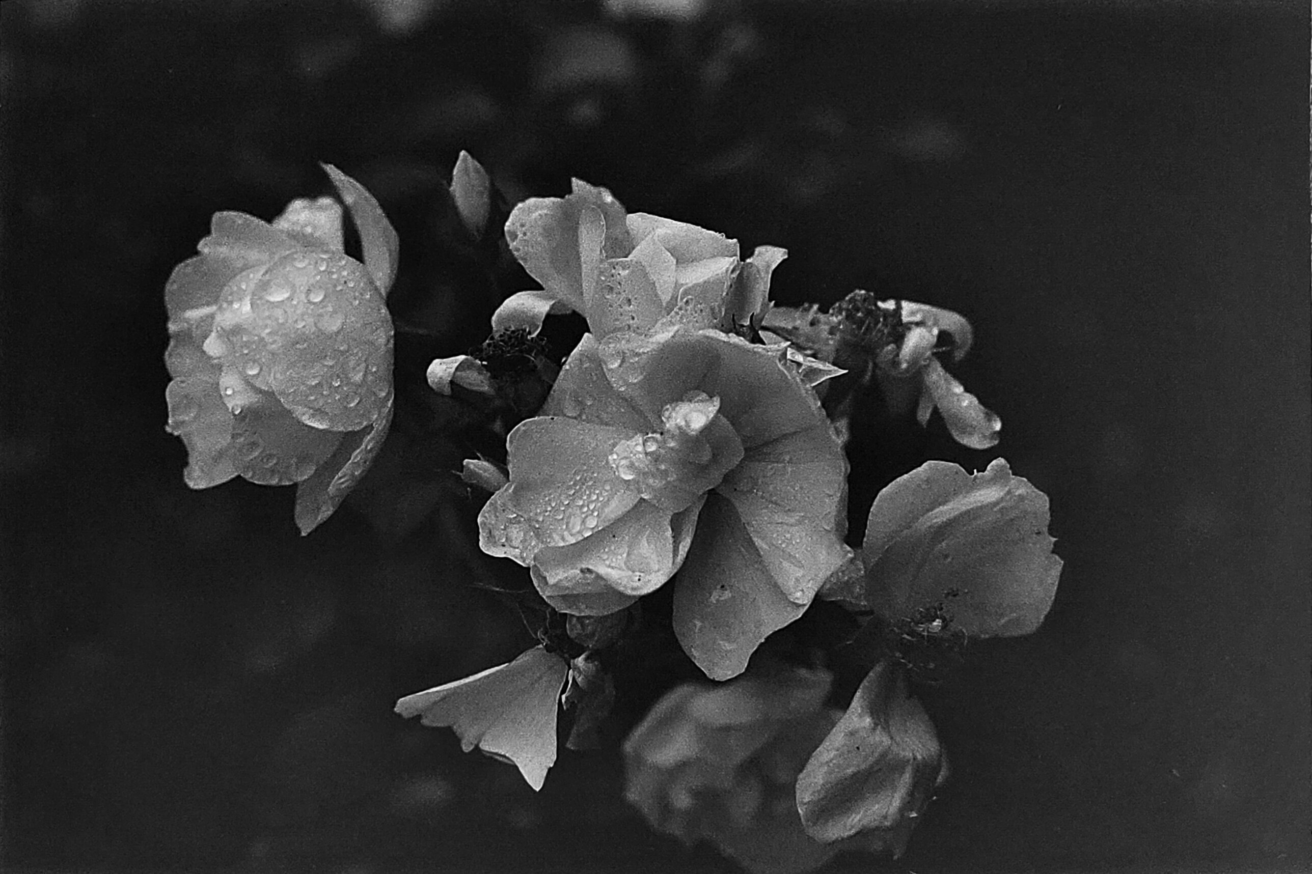
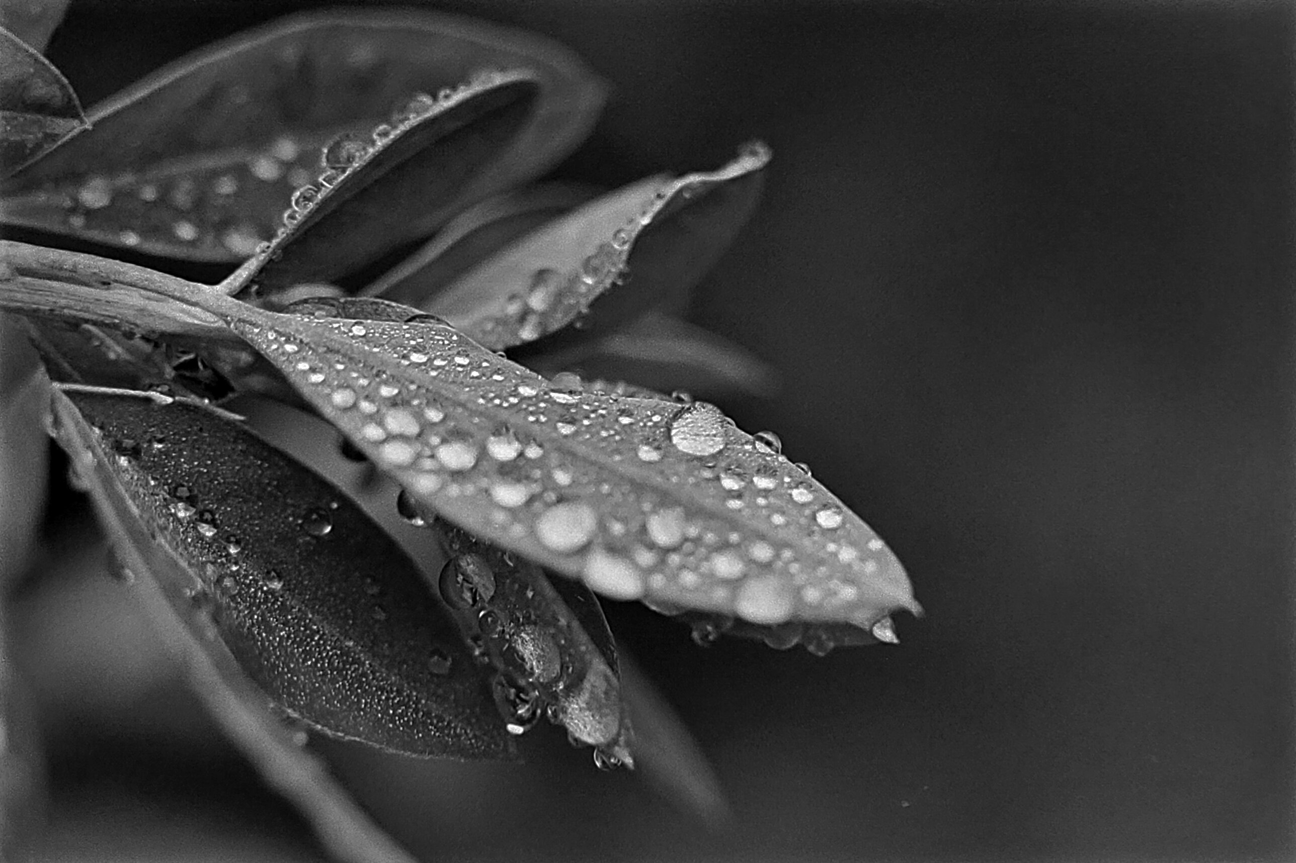
Dew on some flax. This seemed like the best composition out of all of the similar ones below. 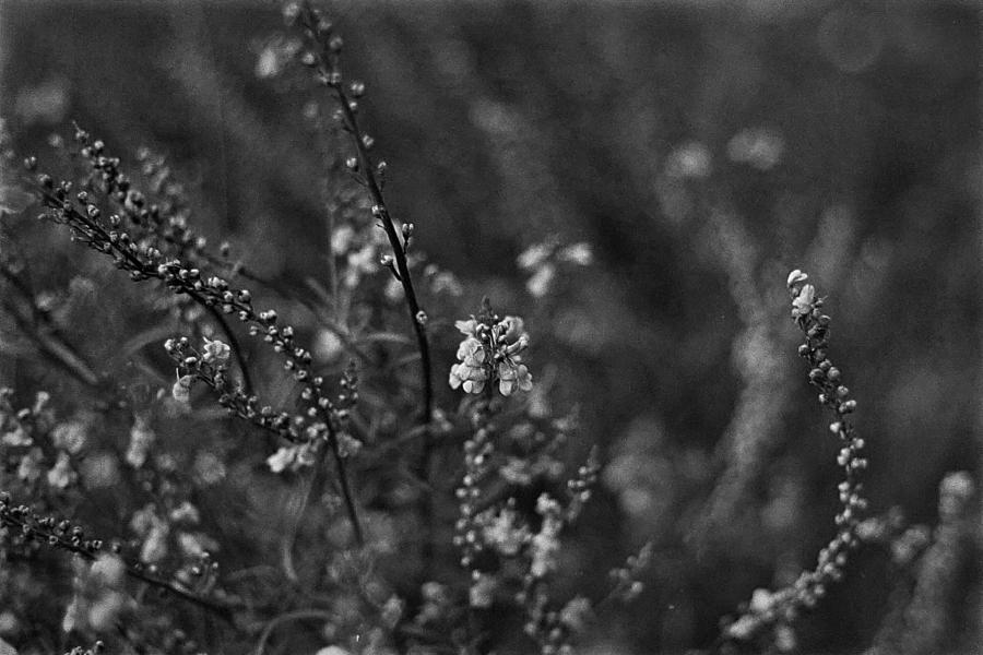
I was very happy to nail the depth of field, which has been a constant issue for me recently. Focusing just before the subject fixes the mismatch between the viewfinder focal plane and the film focal plane, which is apparently misaligned in my camera body. 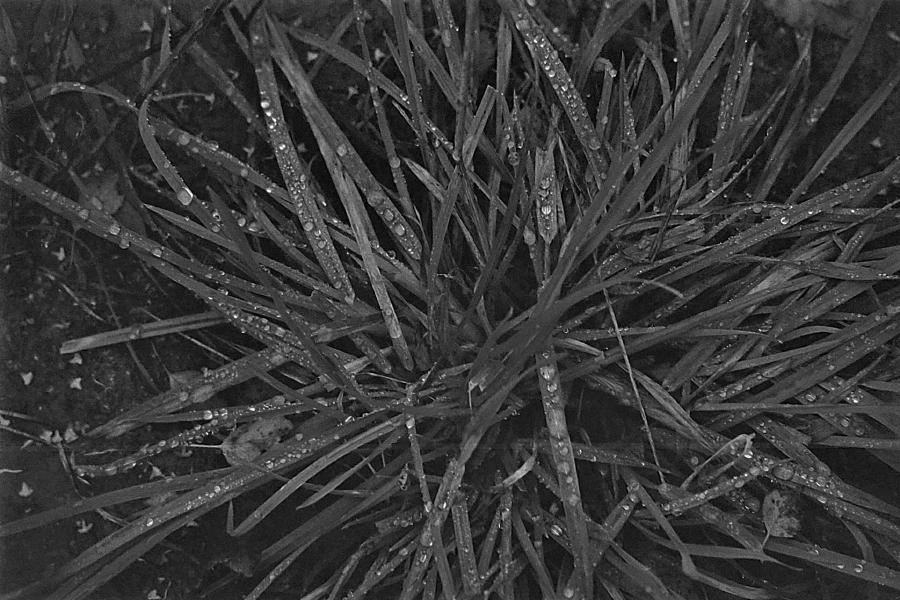
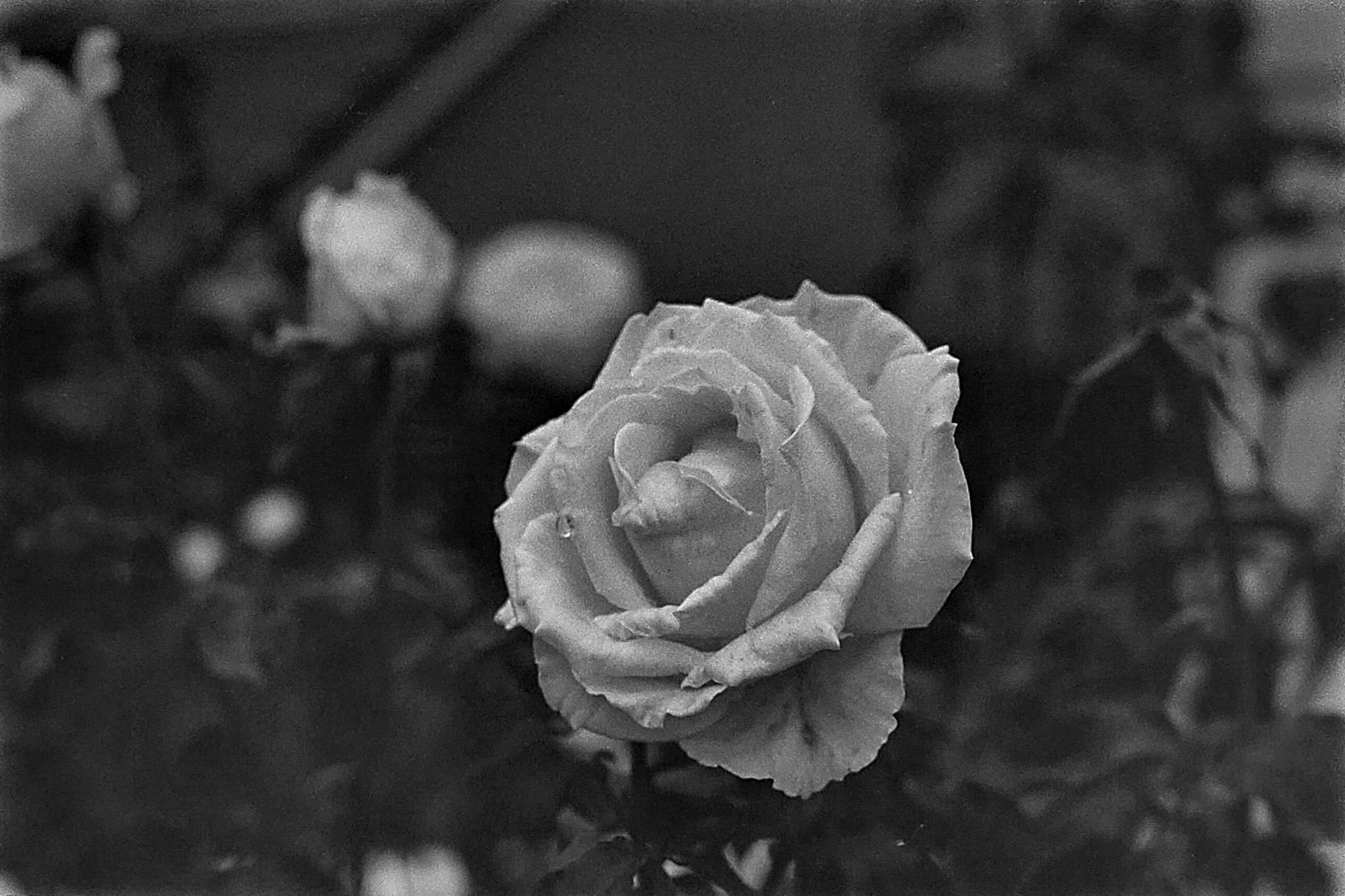
This was taken with the zoom lens at 200mm and at the minimal focusing distance of nearly a meter. I am still impressed by the detail you can get from this kind of lens! 
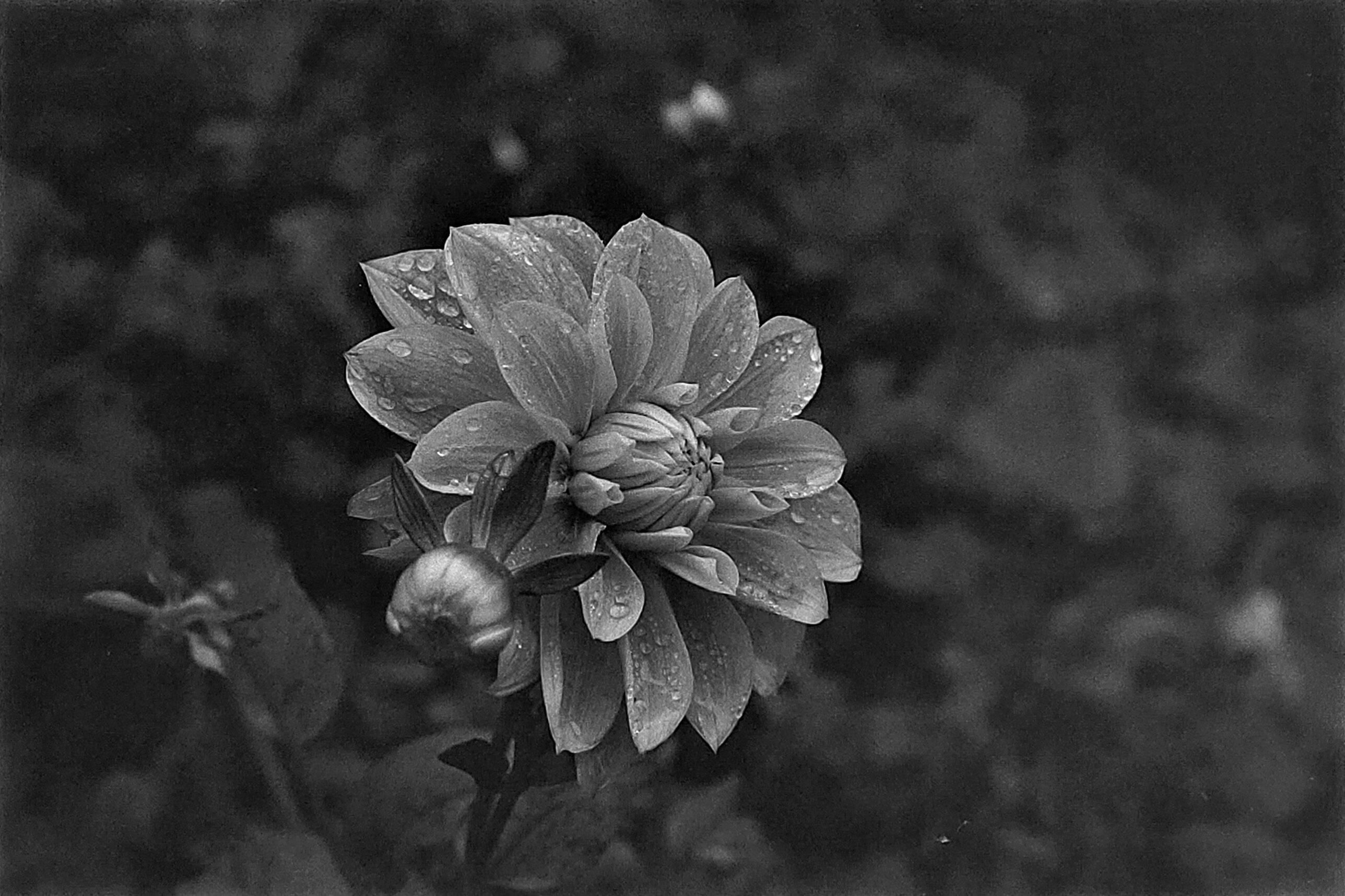
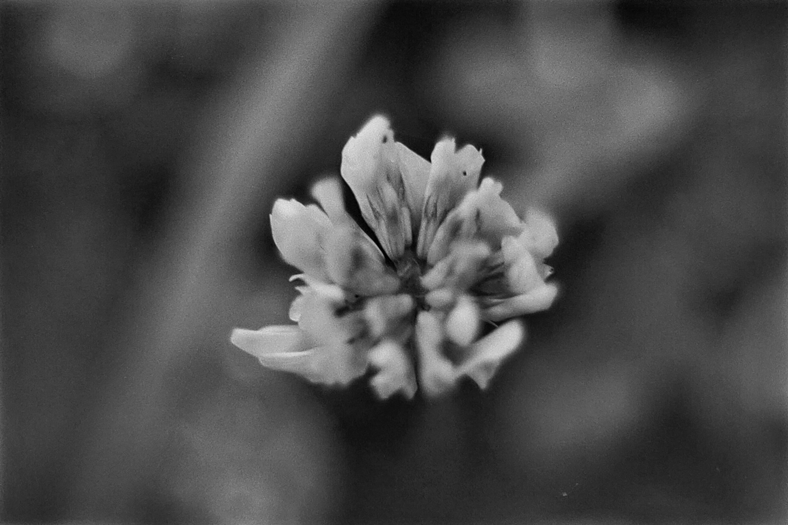
The depth of field was just a little too thin here, and didn’t cover the entire flower. A shame, but sort of highlights just how difficult these shots can be! 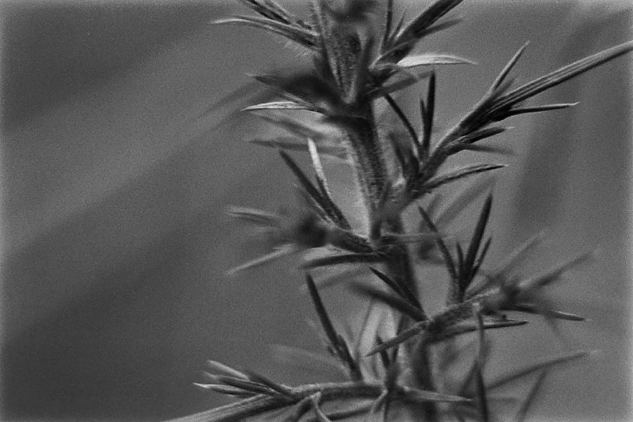
Trying to grow that depth of field by stopping down the aperture, and you must compensate with a longer shutter, leading to blurring like we see here. Alas! 
This was the final exposure of the roll. The dust here was from the remaining moisture trapped beneath the clothes peg used for drying the roll. Hence the greater amount of noise and debris! Still, I like the composition, and I don’t mind the artifacts. Trichromes
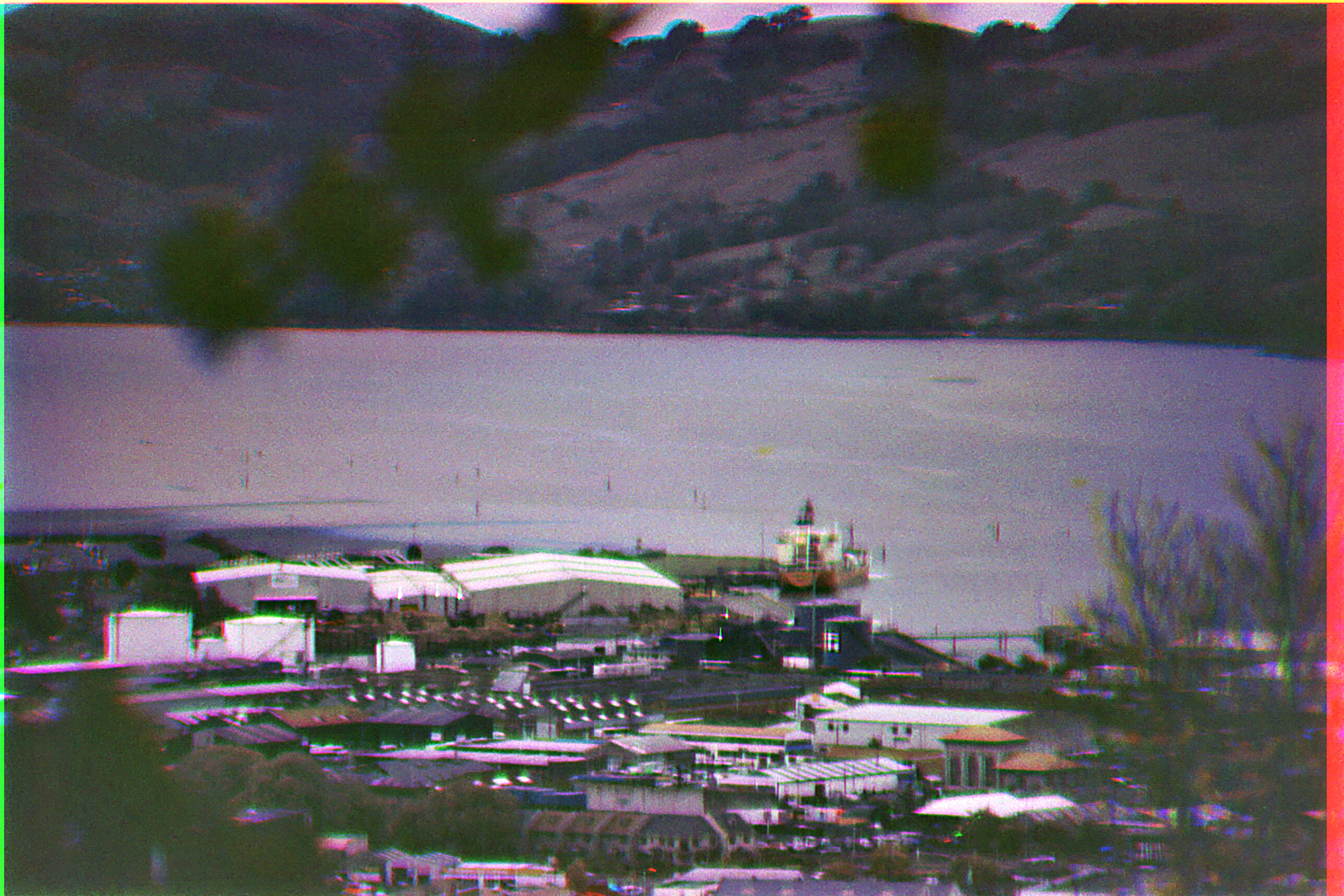
Unfortunately just a little too much movement between the red and green / blue channels in this shot, leading to a lot of aberration. What is still visible is the movement of the crane which is ghosting something wicked between each channel! 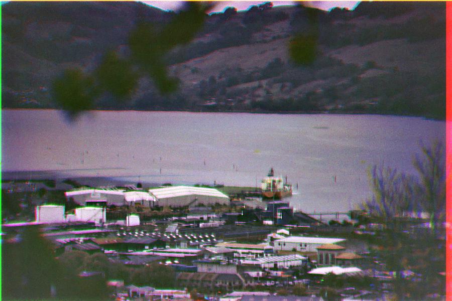
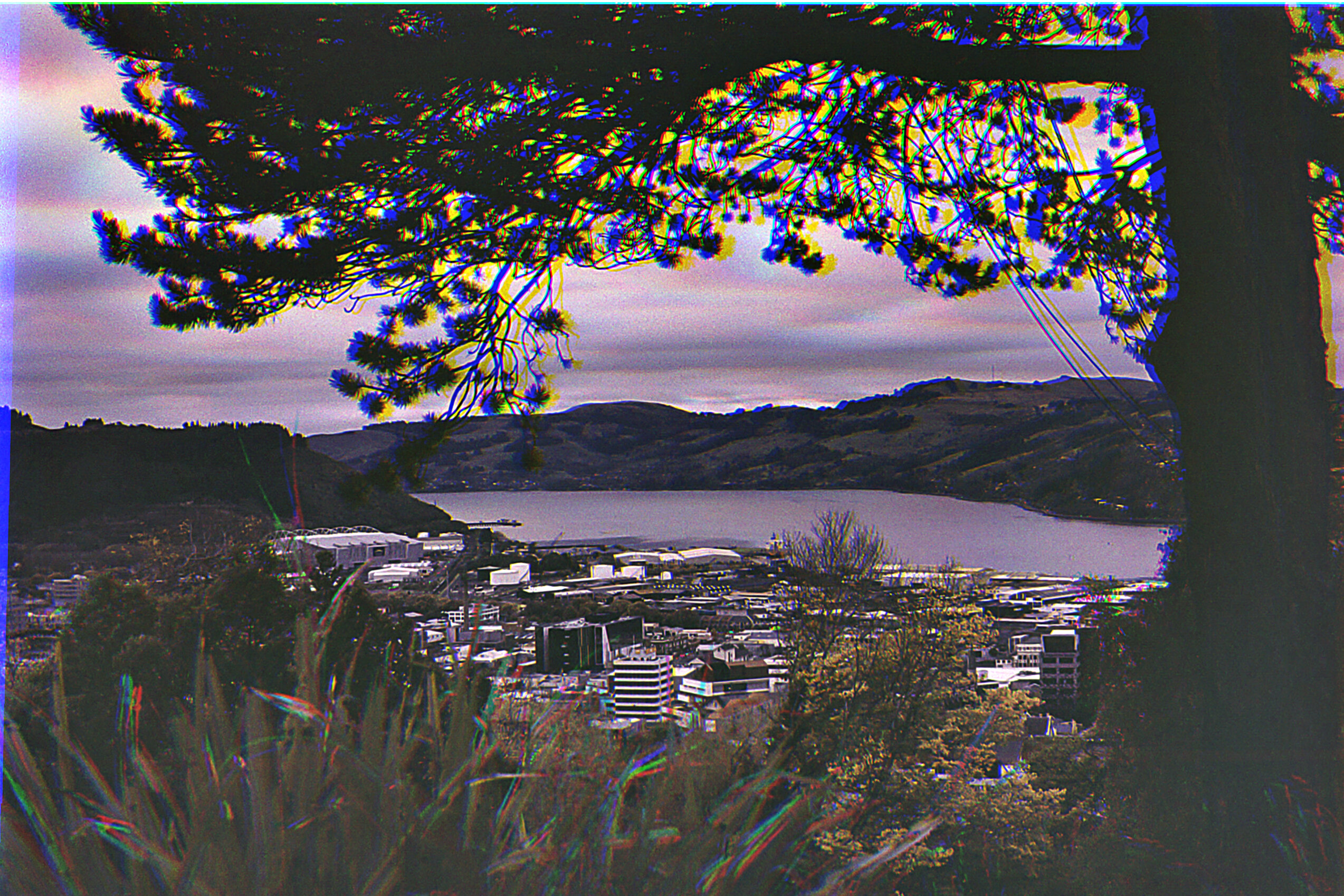
A slightly blurry trichrome of the industrial district. I am not sure why these frames came out so blurry, perhaps the wind moved the tripod just enough? Maybe it was the mirror. Oh well, it’s nice enough. Black and White
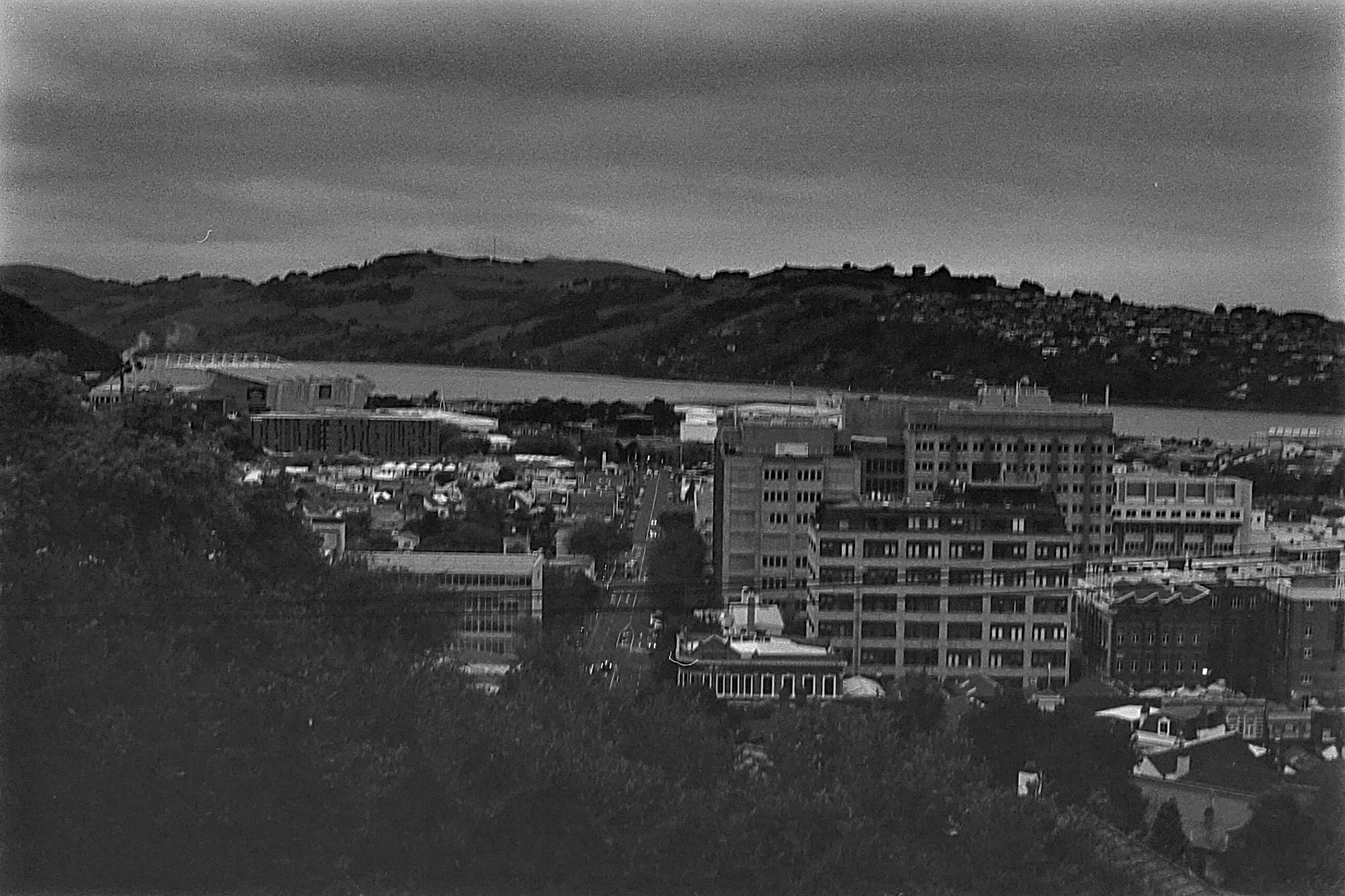
Here’s a comparison shot to the previous roll. This was a little blurry, since I took this handheld rather than on a tripod. You can tell there is significantly more grain on this film, but it’s not a bad thing. 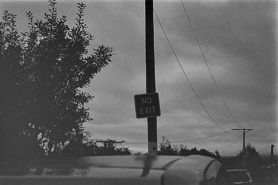
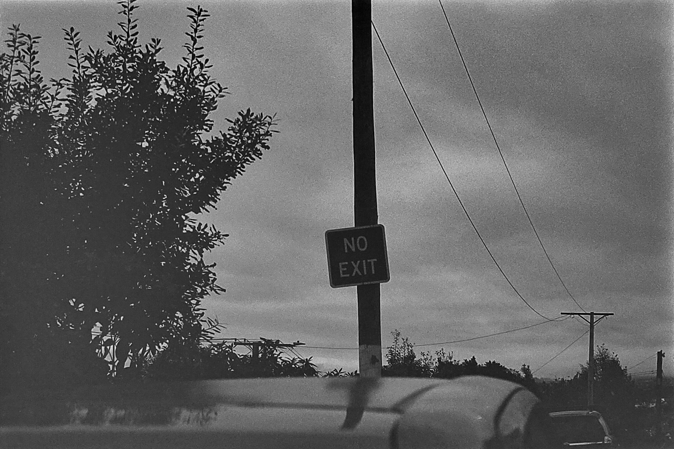
A nice contrast-y street sign. To get detail on the sign I had to make the tree on the left super muddy, which is unfortunate, but I still like the photo. 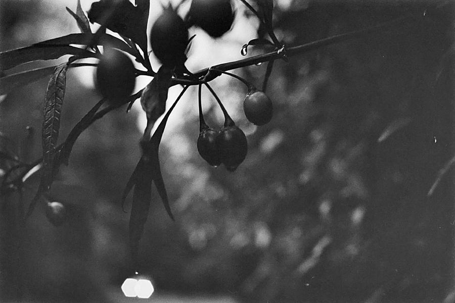
Here’s some fruit with some morning dew coalescing. Although the fruit is in focus (whoop!) they are not exposed correctly, since they were backlit by the bright sky. Oh well, live and learn! 
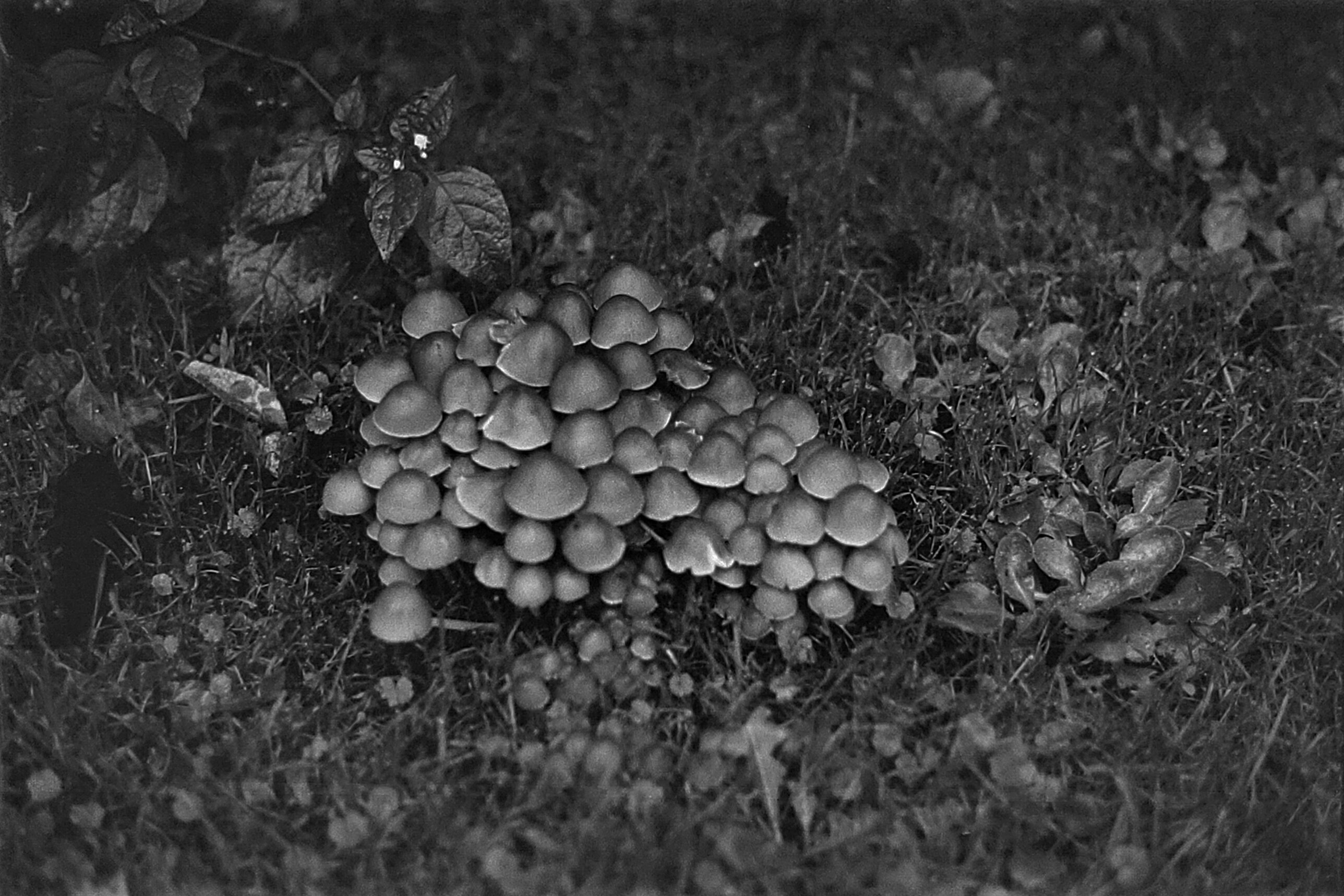
A colony of mushrooms. Is that the right collective noun for fungi? A family? A gathering? A decomposition? 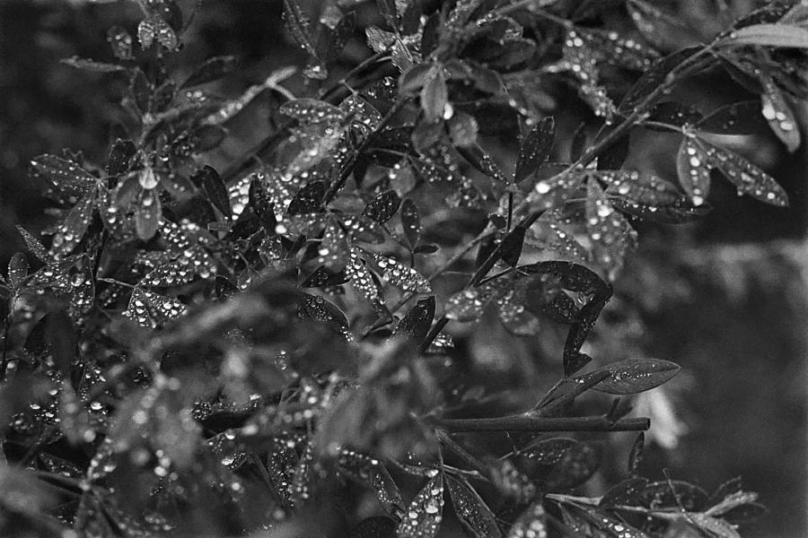
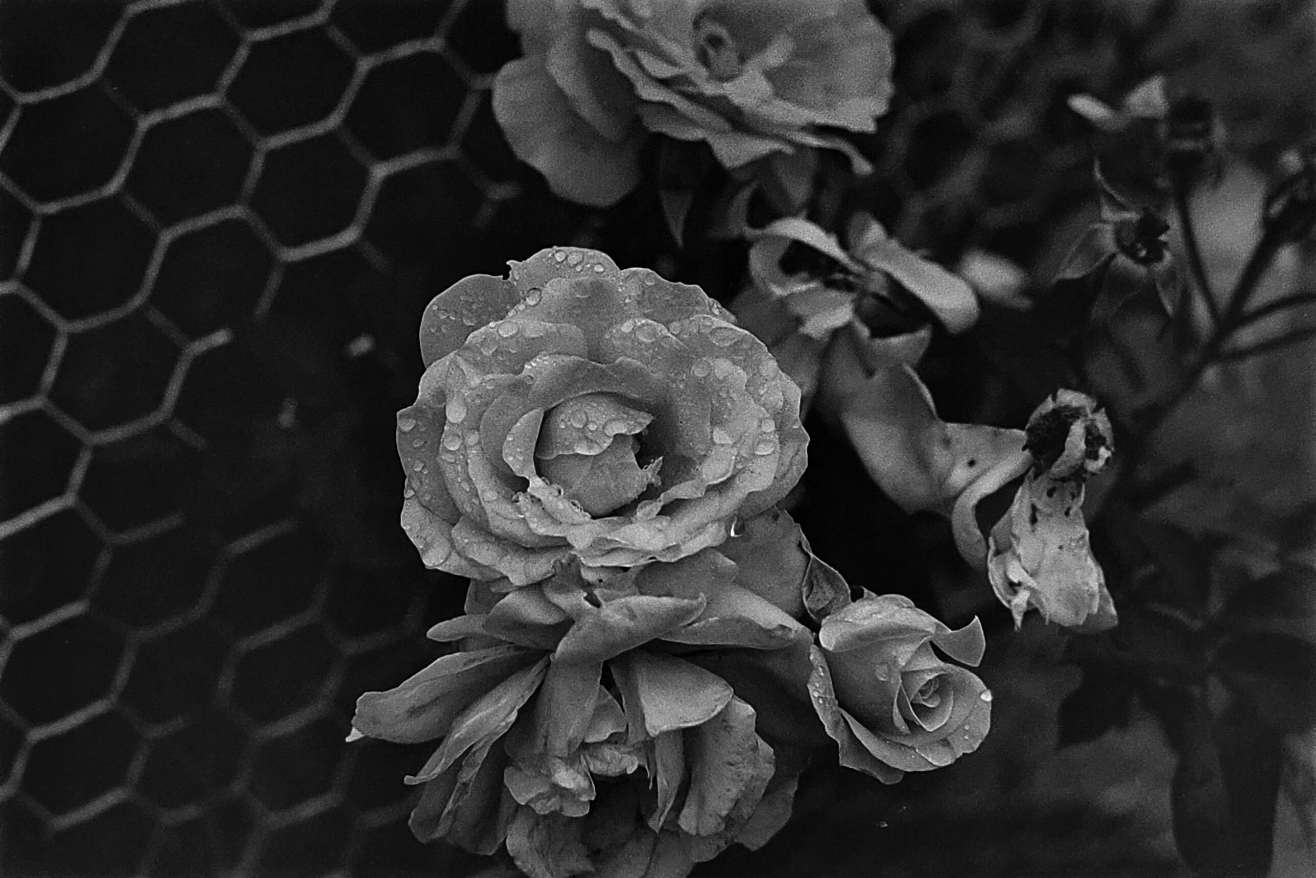
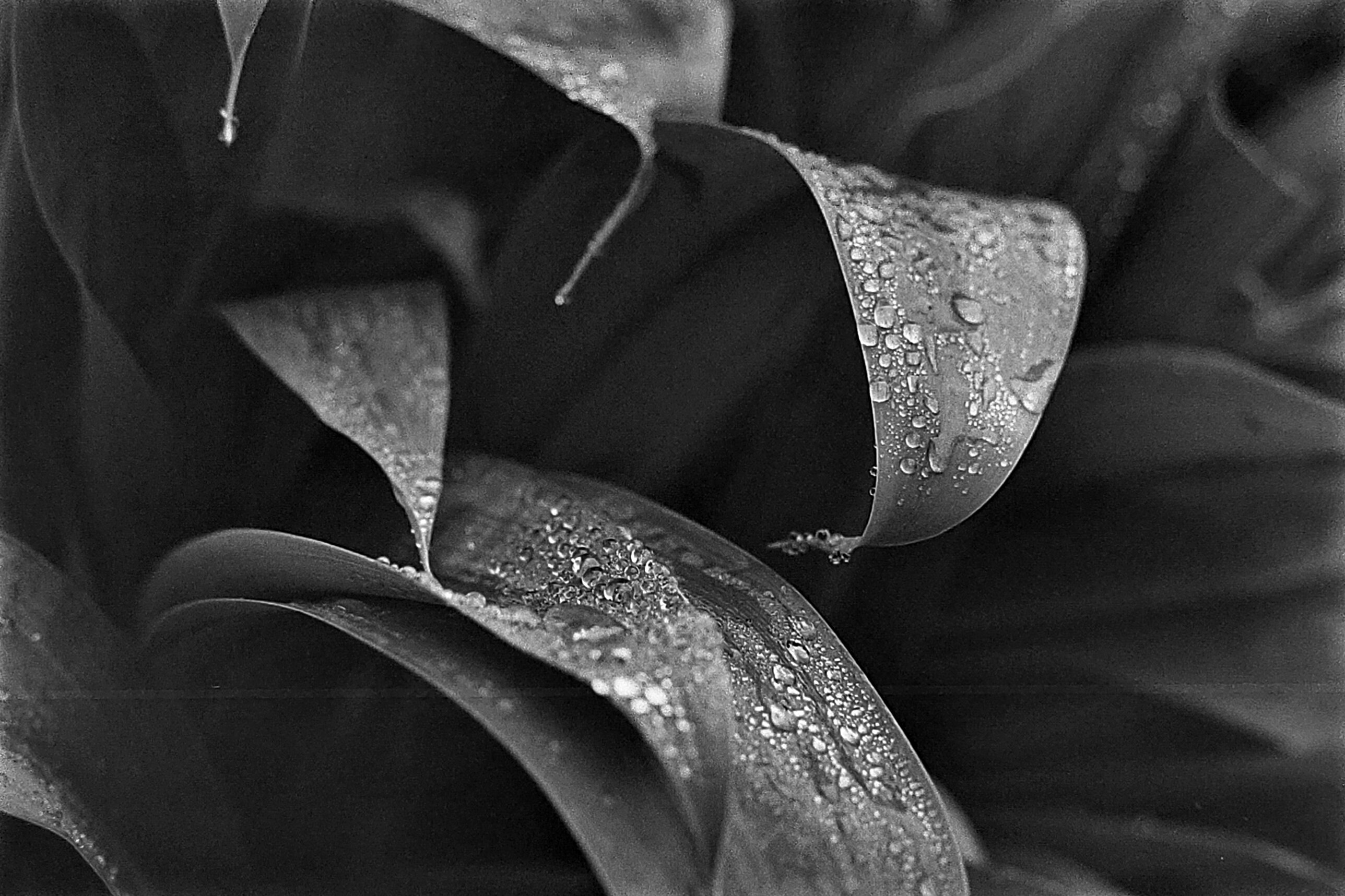
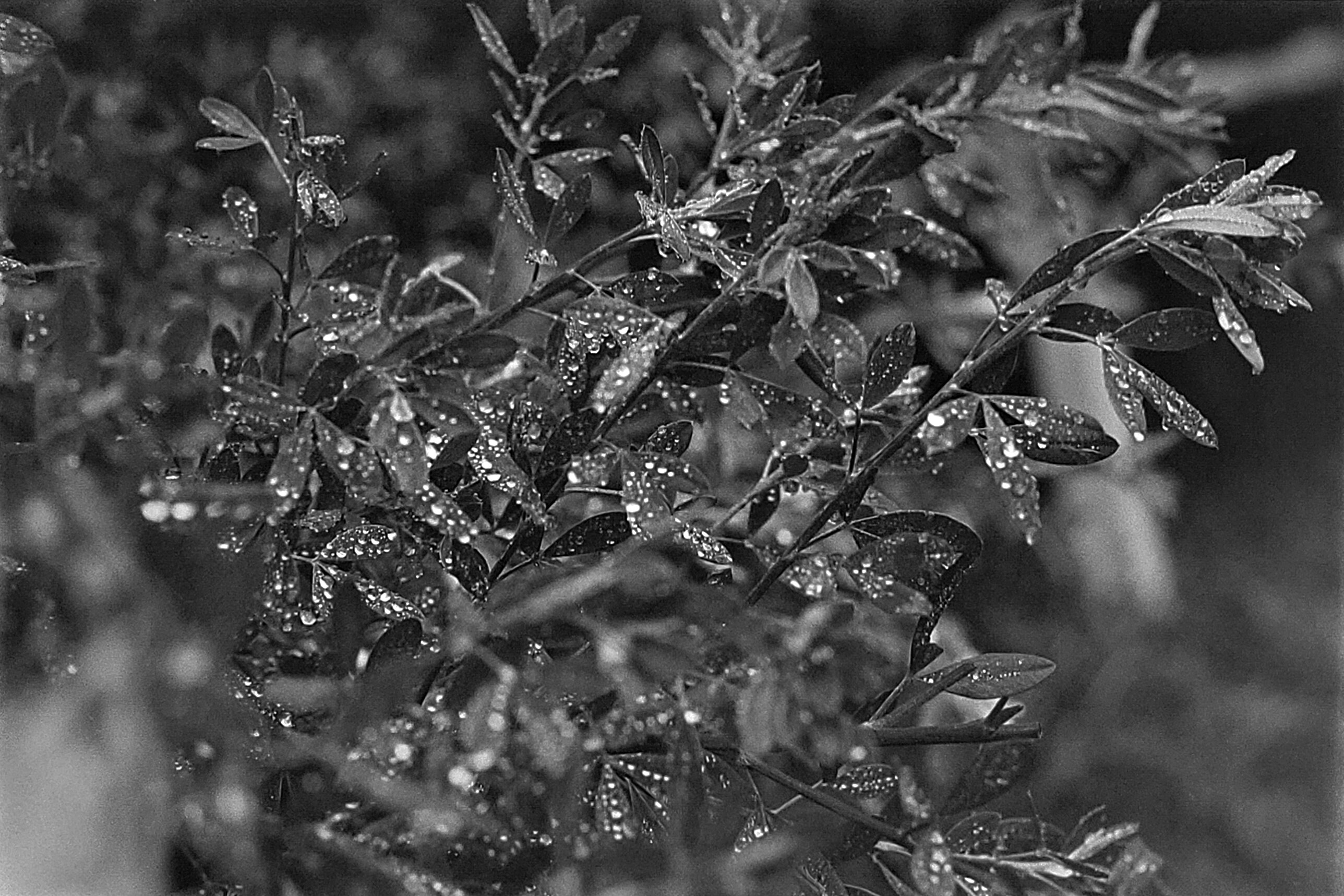
Some lovely dew on some leaves. I like the depth of field here but I think the composition is just a little too busy to be great. 
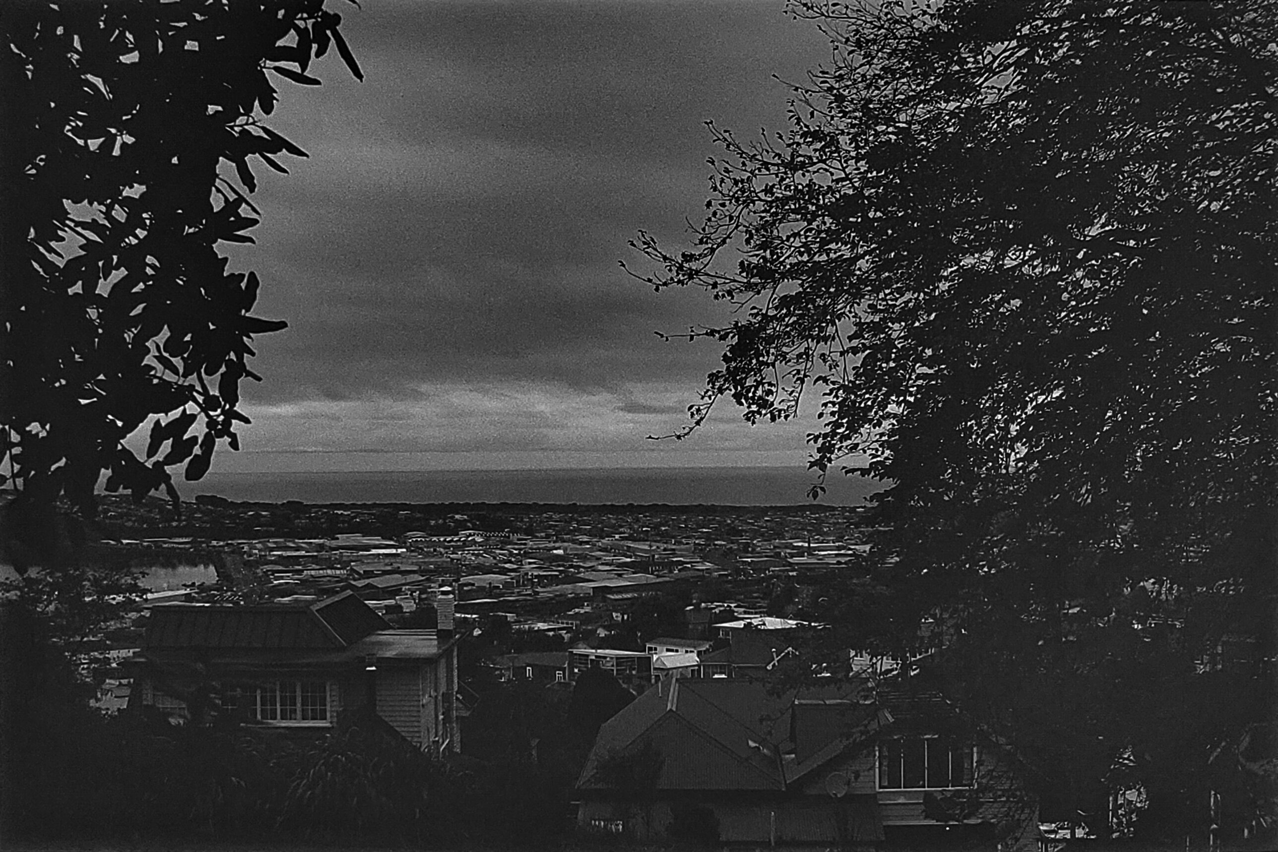
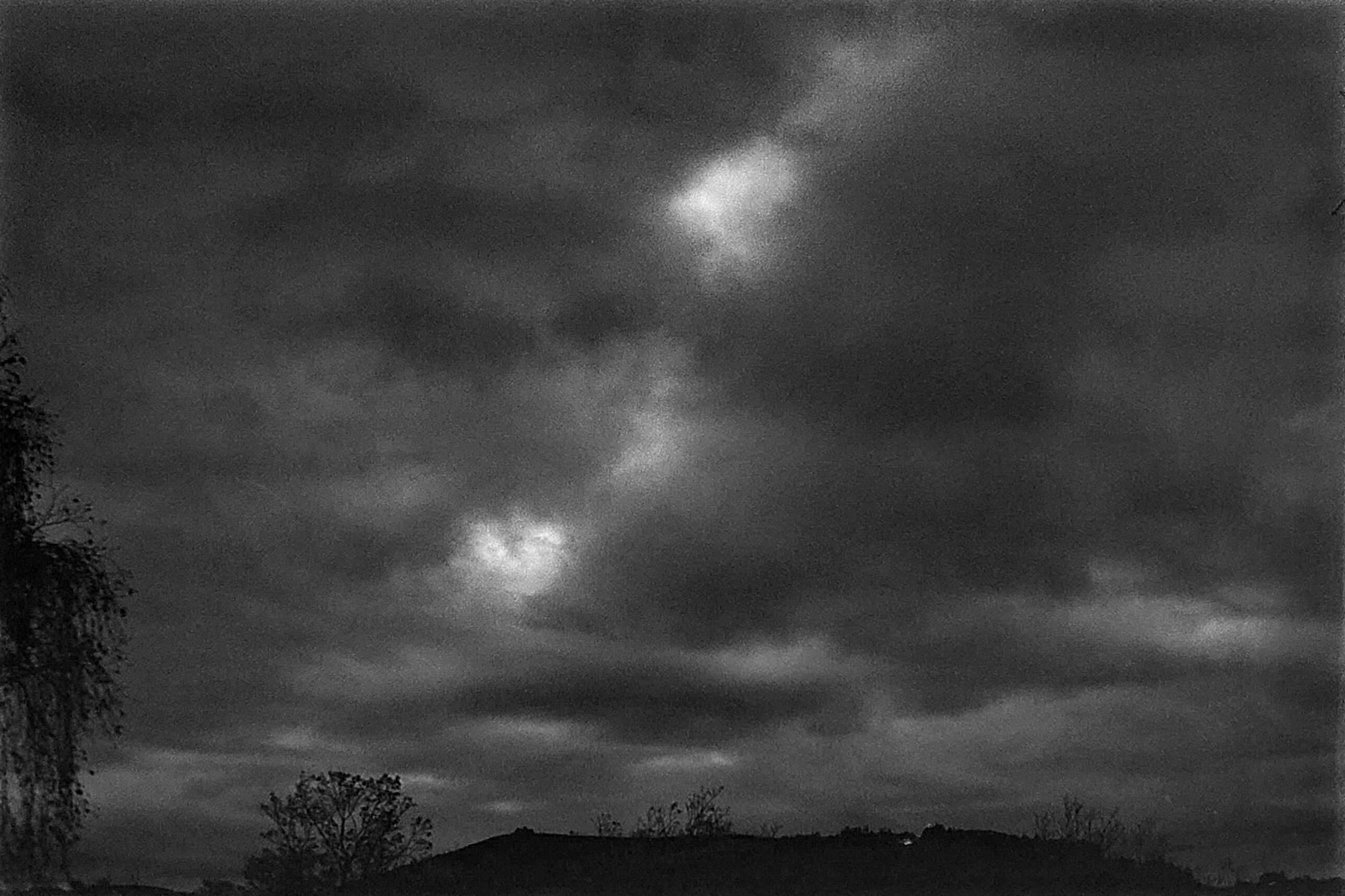
Although this was taken in the golden hour, the black and white film as well as the editing makes this more moody. One could imagine this is not a beautiful sunrise, but an approaching storm. 
And here the effect is emphasized with a red filter. Long live high contrast skies! 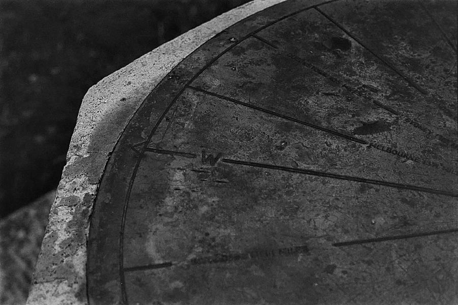
This is a metal compass set into a concrete plinth. I like that in this shot we get all the detail of the slowly crumbling concrete as well as the oxidized and gouged metal. I think it’s just a very interesting shot. 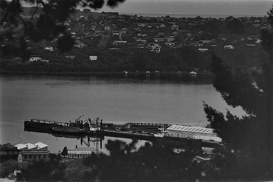
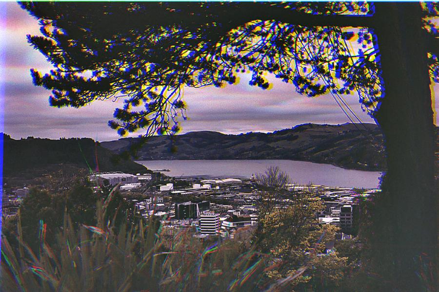
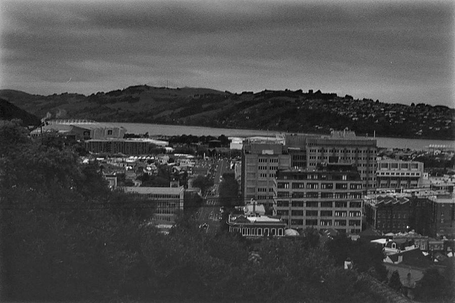
The Port of Dunedin at range. Feels almost like peeking into another world.